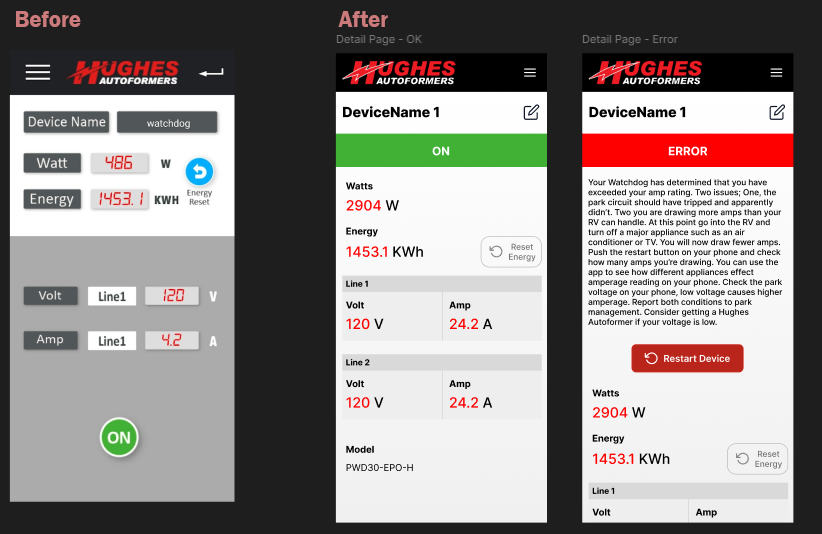
Living off-grid makes reliable power management essential. While not a daily-use app, the Hughes Autoformers tool was a critical utility for my power structure—yet its convoluted navigation and "silent" automatic restarts often hid vital error codes before I could diagnose them.
Designed in Figma, this concept redesign transforms a passive monitor into an active diagnostic interface. By prioritizing persistent error states, manual restart controls, and high-contrast legibility, I focused on reducing cognitive load to ensure that maintaining power stability is fast, transparent, and intuitive when it matters most.The Home Page: From Friction to Visibility
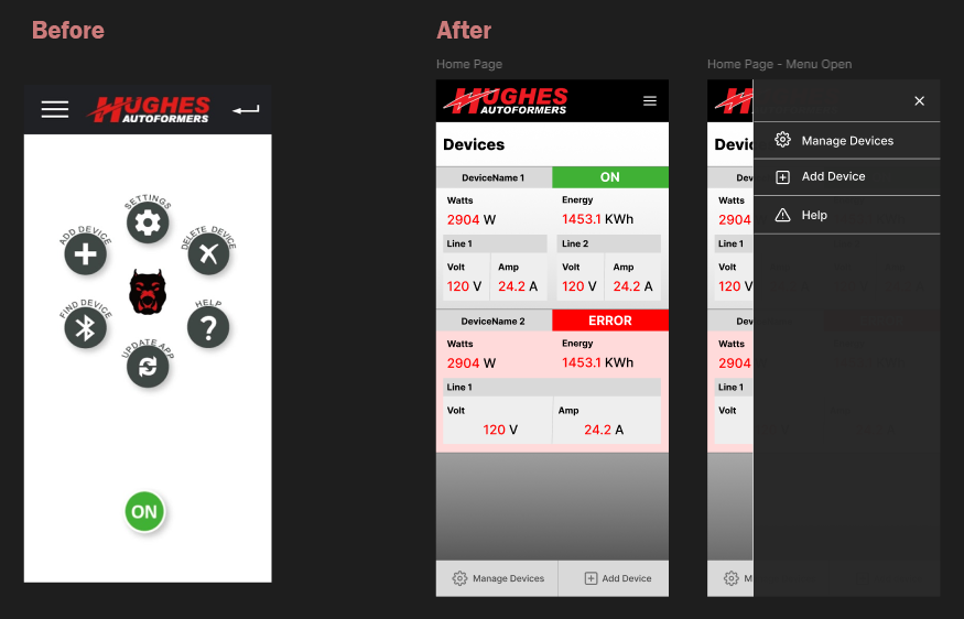
The original landing page functioned as a gatekeeper rather than a dashboard. Its circular menu was difficult to read, contained irrelevant options, and utilized an ambiguous "ON" icon that provided little context. Most importantly, it forced a high-friction workflow: users had to click "find device," wait for a scan, and navigate through a list before seeing any data.
My redesign replaces this menu with a card-based "Devices" view that surfaces information immediately upon opening the app. By moving to a scannable list, I've prioritized the most critical metrics—real-time wattage, energy usage, and line status—while using clear, color-coded indicators for "ON" and "ERROR" states. This shift reduces the time-to-info from a multi-step process down to a single glance.
Device Management: Clarity Through Standardized UI
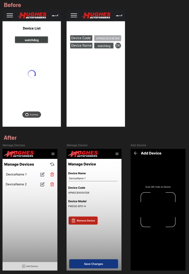
Managing devices in the original application was a lesson in visual ambiguity. Key interactive elements were buried in gray-on-white boxes with no clear signifiers for buttons or actions, making it difficult to understand how to edit or update specific hardware. The lack of visual hierarchy meant that managing the power system felt like navigating a spreadsheet rather than using a tool.
In the redesign, I implemented standardized UI patterns to remove guesswork. Using a familiar list view with dedicated edit and delete icons, the "Manage Devices" screen now offers immediate clarity on how to interact with the system. I also streamlined the setup process by introducing a QR code scanner for adding new devices, replacing manual entry with a fast, hardware-native solution that fits the "utility tool" nature of the app.
The Detail View: Prioritizing Intelligence Over Information
In the original design, error handling was a passive experience. The hardware would identify an issue and automatically restart before the user could even register what had happened. This created a frustrating loop where power would cut, the device would reset, and the cycle would repeat every few minutes without the user ever seeing the diagnostic code. Furthermore, the information layout lacked hierarchy, making it difficult to differentiate between static labels and real-time data.
My redesign transforms the detail page from a basic display into a diagnostic tool. Key updates include:
Persistent Error States: Instead of an automatic, silent restart, the app now maintains the error state, providing a detailed explanation of the issue (such as exceeding amp ratings). This allows the user to identify and fix the electrical problem before manually triggering a Restart Device action.
Enhanced Information Hierarchy: By moving away from the "gray box" aesthetic and using bold, high-contrast typography, critical metrics like Watts, Energy, and Line Voltage are now instantly scannable.
Clarity of Status: High-visibility color blocks (Green for "ON," Red for "ERROR") ensure the system's health is clear from across a room, providing the peace of mind required for off-grid living.