For this project I was both the UX designer and the developer to implement the code. I tried to keep the general layout the same, only changing the platform where necessary or where the project called for specific changes. We already used Bootstrap throughout most of the site, and so I continued that here. All of the donor facing pages are responsive as well.
I've broken all of the membership updates down into each of the sections that I worked on.
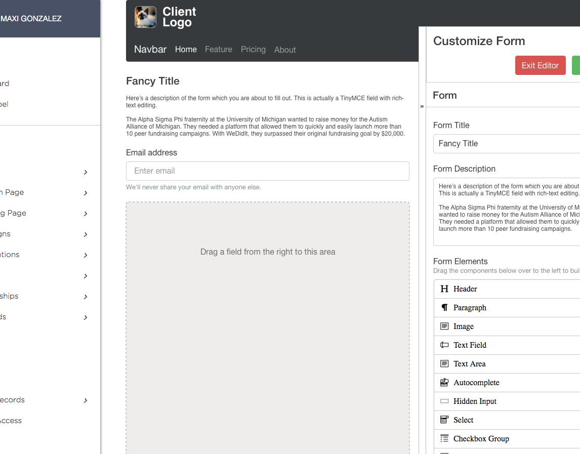
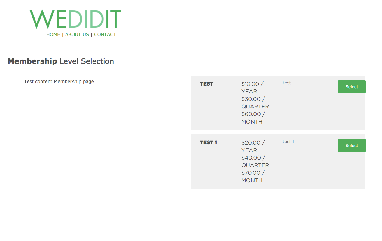
Membership Level Selection Page
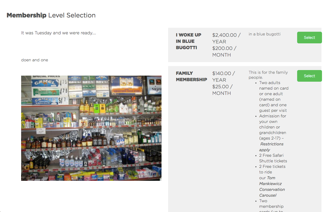
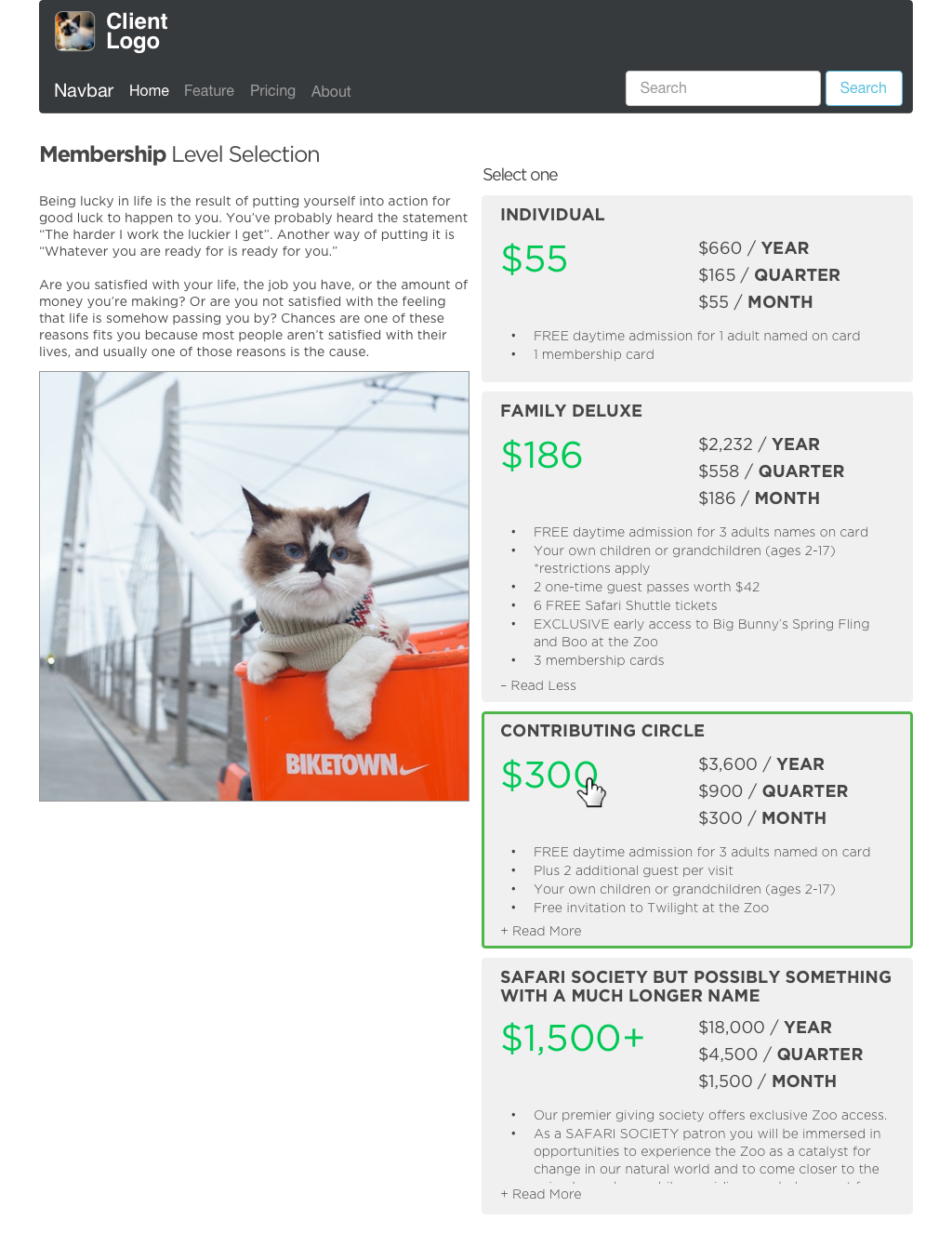
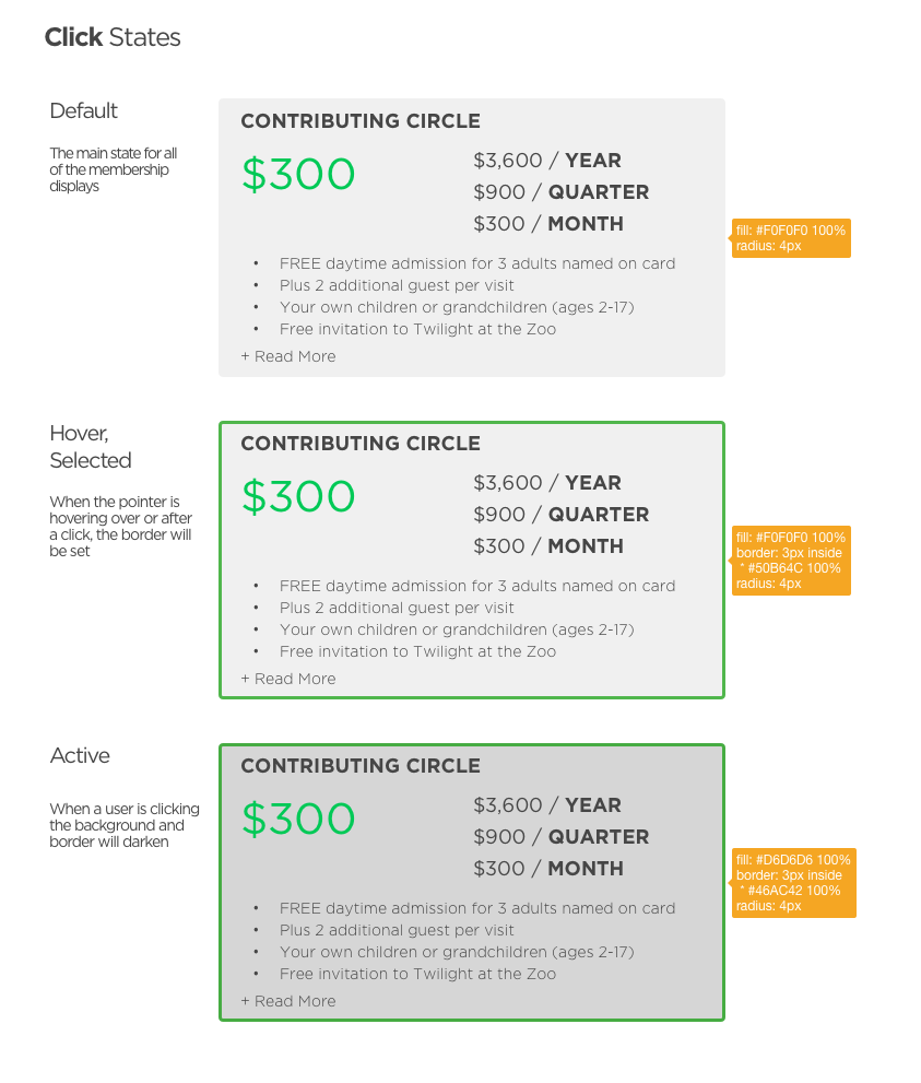
The Level Selection page was very much just a prototype at first, with misaligned elements and poor use of columns. In updating this section my goal was to add a cohesive design that would last throughout the rest of the membership pages. I used a card style layout with subtle user interaction elements that would work on desktop or mobile. These are also dynamic, showing up and changing what's shown based on what settings and membership levels the client has chosen in their settings.
One of the harder parts of this page was creating an expanding description within each of the cards that wouldn't trigger a page change (since clicking elsewhere on a card would go to the checkout flow). Also it would only show "Read More" if the description content was over a certain pixel height.
Before
After
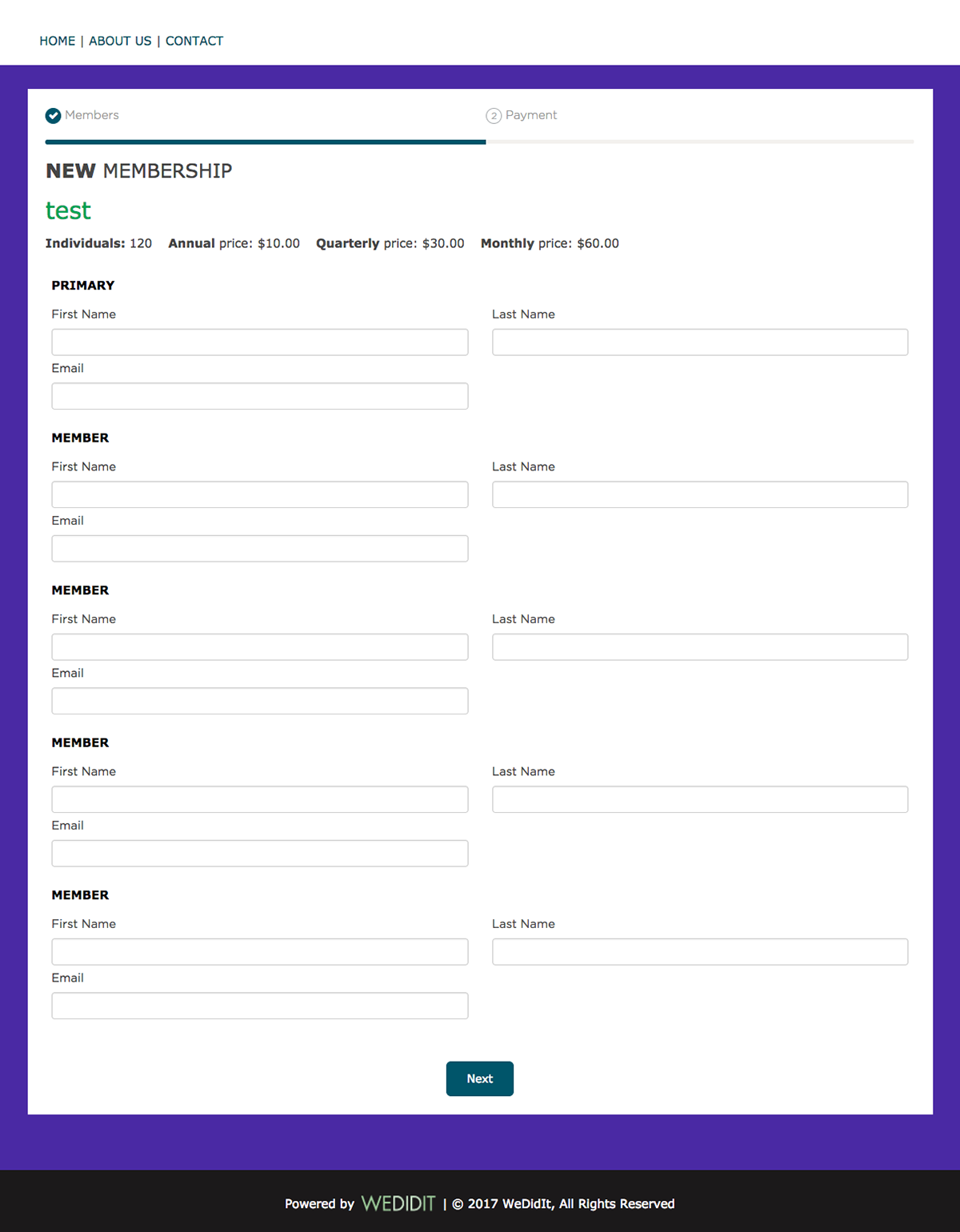
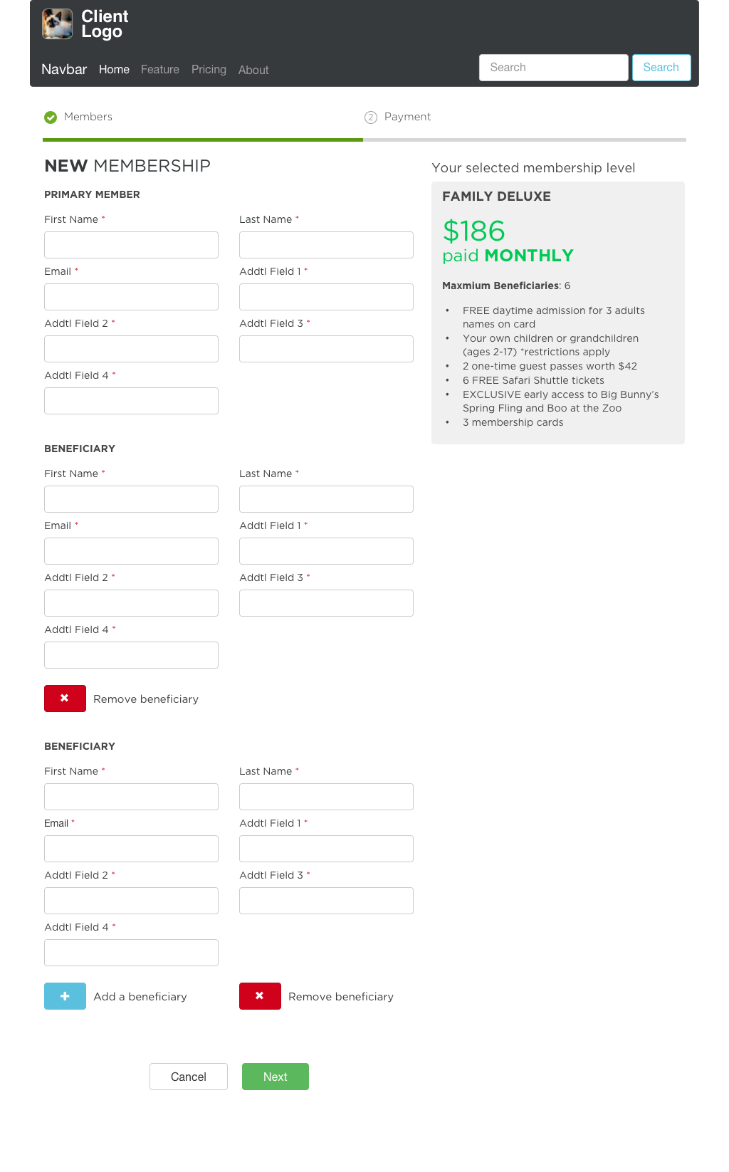
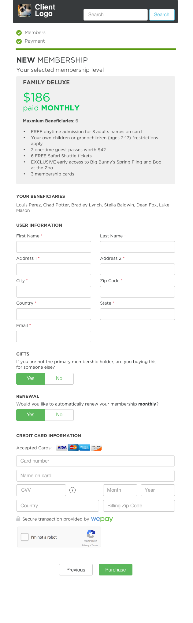
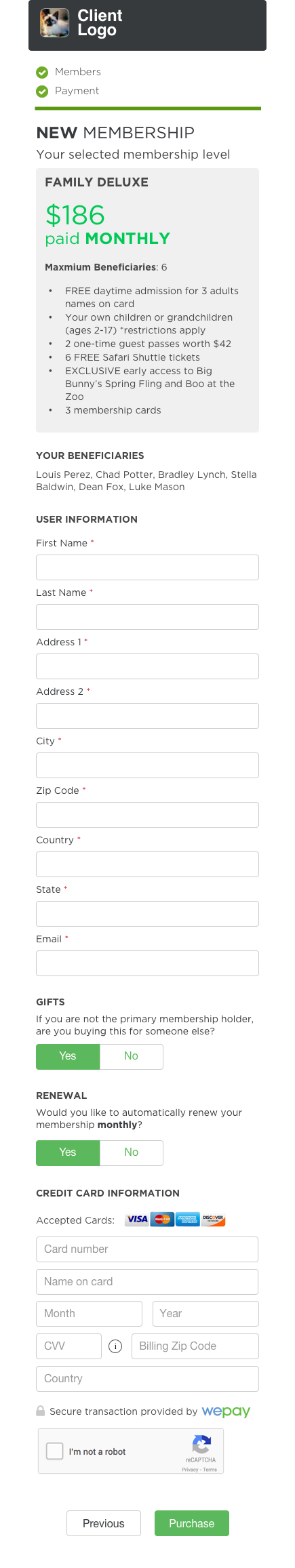
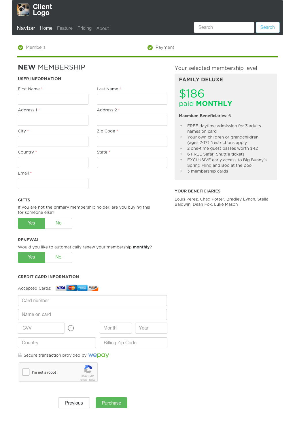
Membership Level Purchase Flow
The purchase/checkout flow needed a heavy redesign. The proof of concept was barely responsive and would show as many beneficiaries as the client decided was necessary (which could be as many as 99 if they so chose). So for this page I implemented a JavaScript controlled template which would only be expanded when the donor decided they wanted to add beneficiaries in a "Add More" pattern.
I also wanted to make sure the context of the membership level persisted through the whole process, so I used the modular view I created on the Level Select page (above) here. Adding a couple controls to help with specific display controls depending on context.
I also felt that it would be prudent to change the check boxes into Yes/No switches, since they are easier to see and better for use on touch screens.
Again, this page was fully responsive, and you can see the ways it adapts to various resolutions.
Before
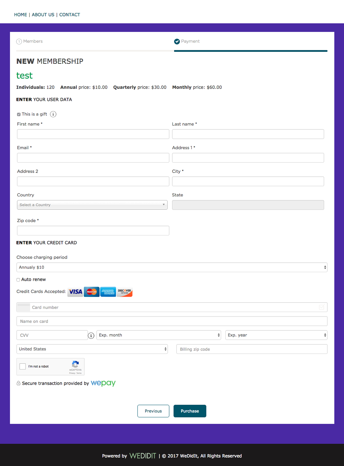
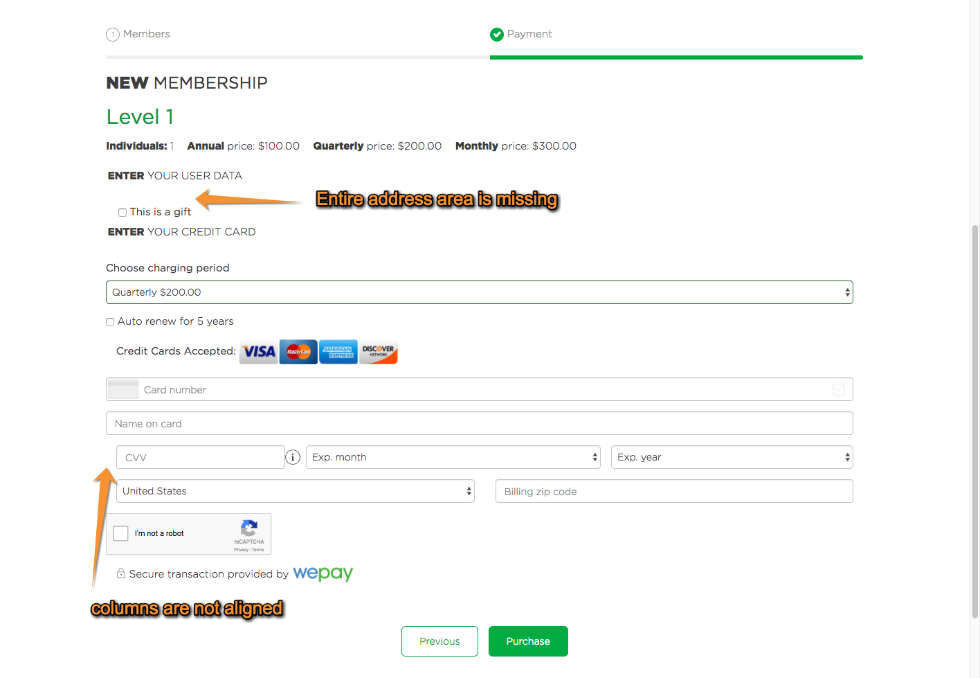
After
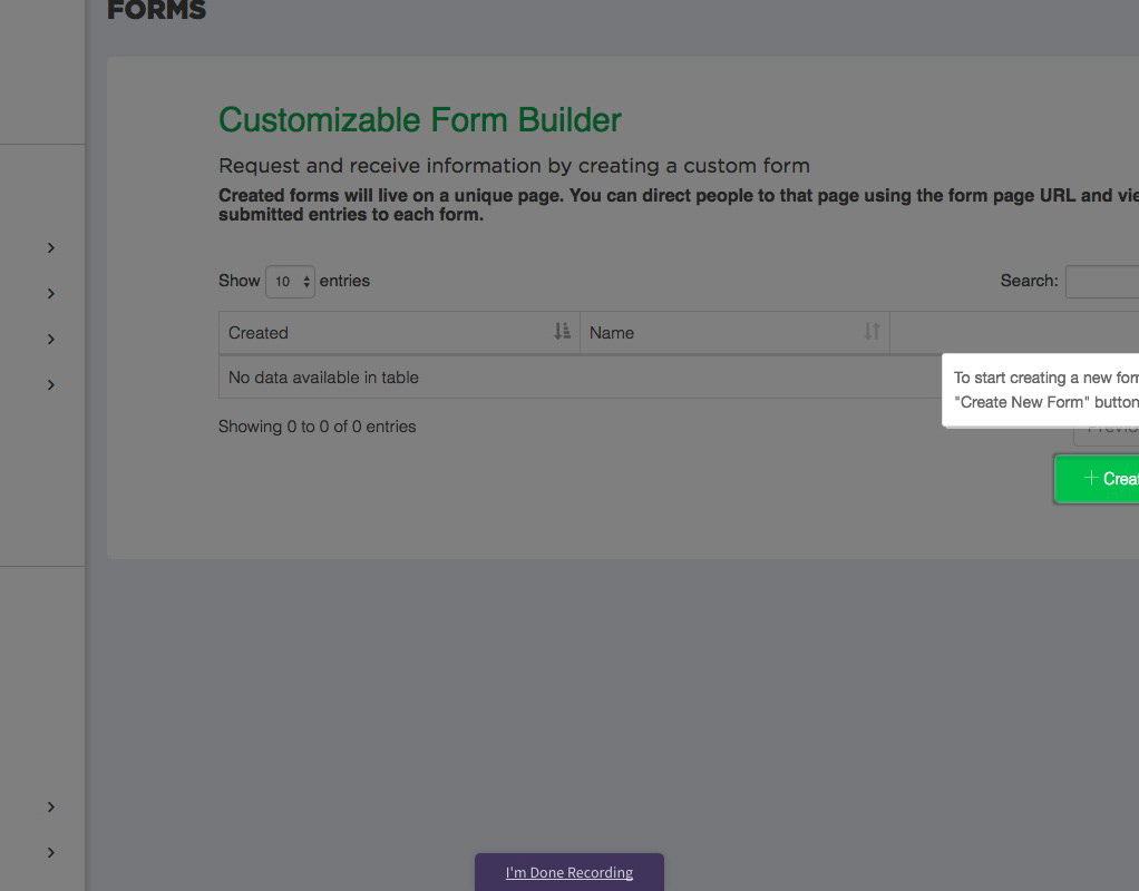
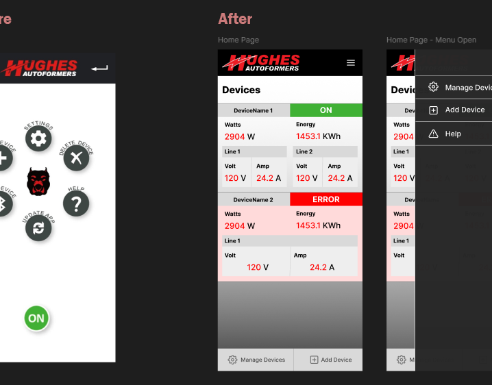
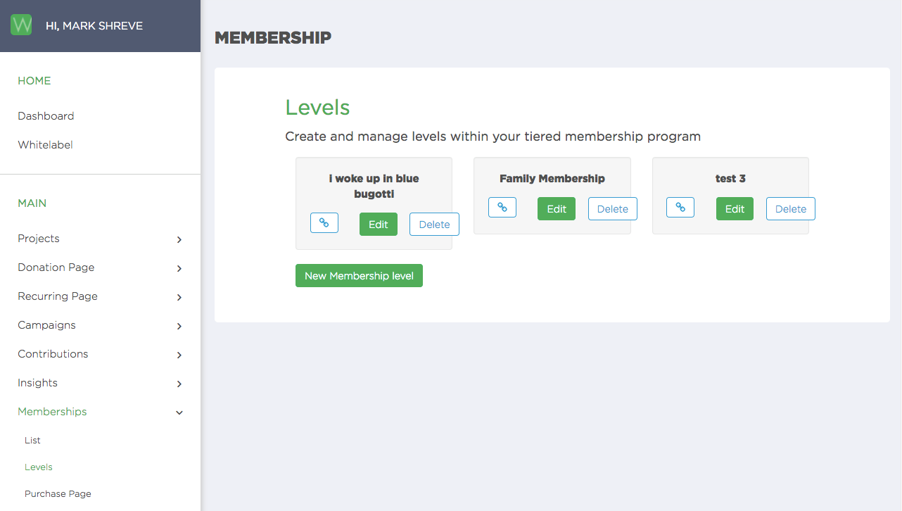
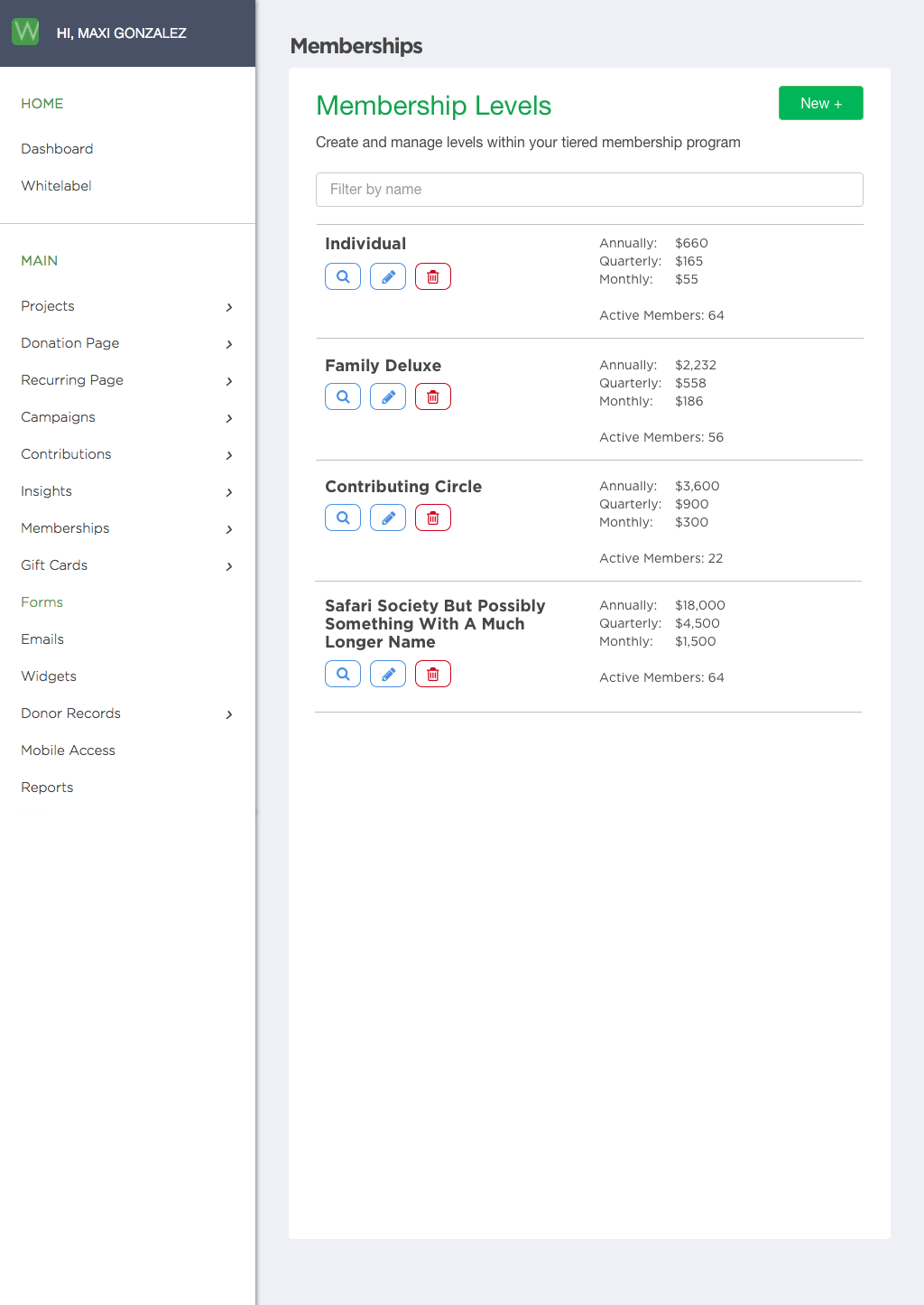
Admin View - Membership Level List
The "before" was simply a proof of concept and I wanted to come up with a view that was more inline with other administrative tools on our site and was able to show some information to make it more valuable at a glance. To do this I turned the large buttons into smaller recognizable icons, and turned the cards into a list.
Before
After
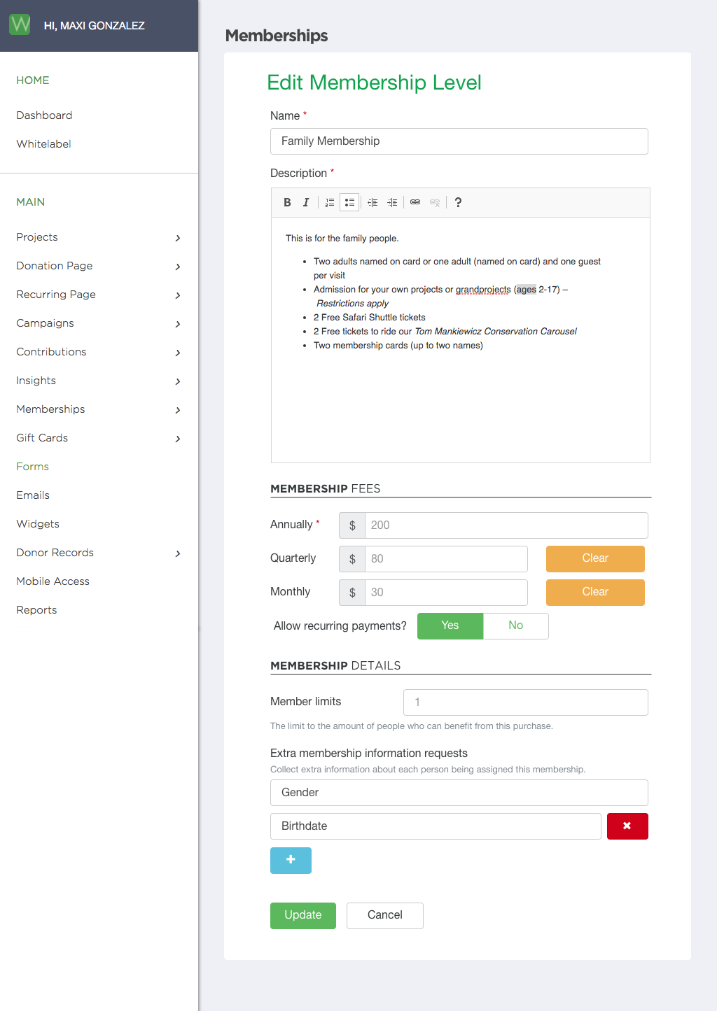
Admin View - Membership Level Editor
The editor for each of the membership levels was also previously only a proof of concept, so when I designed these I tried to simplify it as much as possible while also giving a bit of visual continuity. I broke it into logical sections and used Bootstrap patterns to add more context than it had before.
Also, the "additional member fields" which enable clients to request more text information from donors when checking out was presented as just a comma separated list. To avoid confusion I wrote some code to parse this list and turn it into separate text fields which could be controlled with a GUI. So no platform changes needed to be made, when any changes are made they are updated in a hidden field that is the same comma separated list as before.
Before
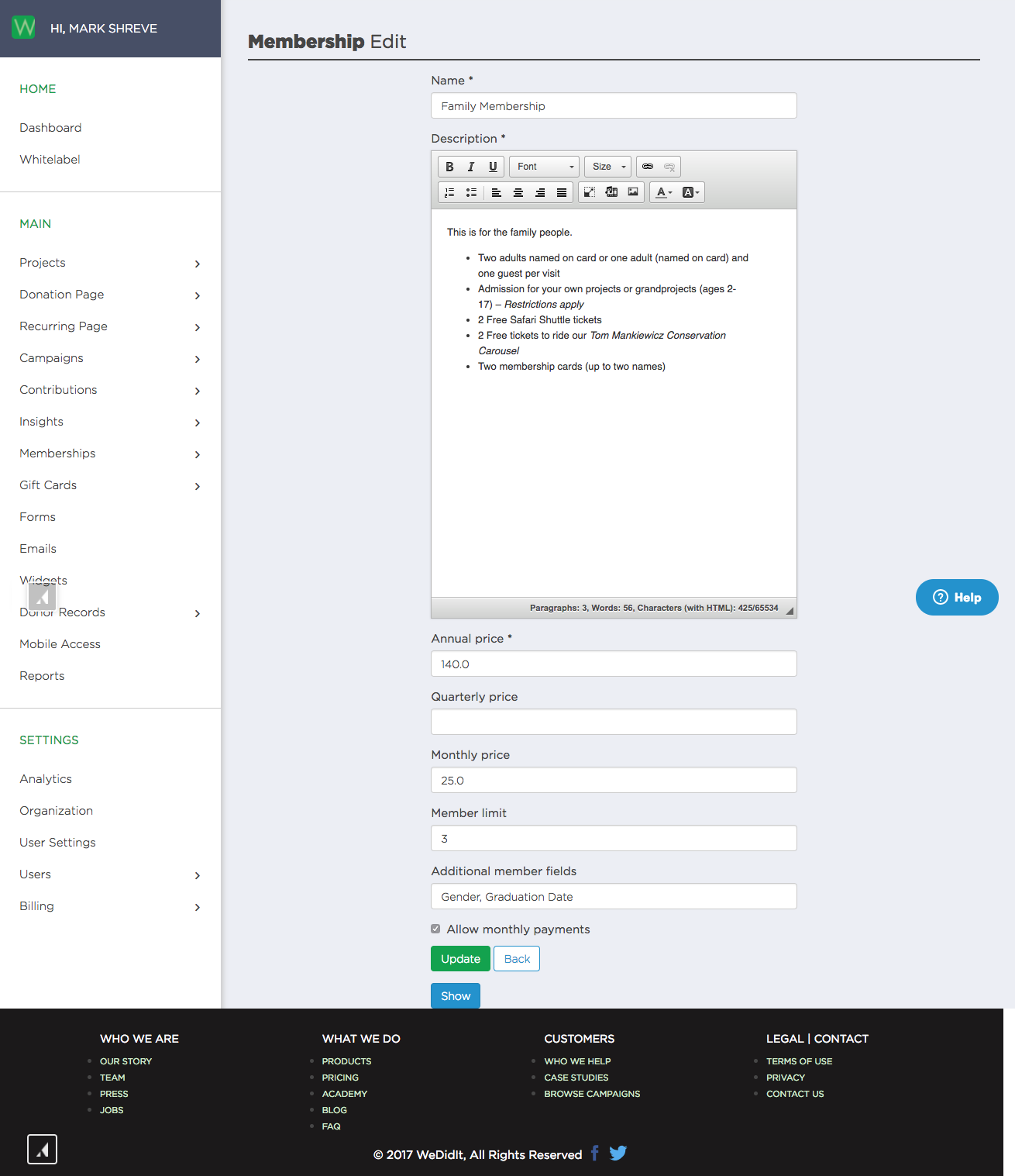
After